User Interface Manager
I directed a cross-functional creative team of designers and writers to deliver scalable user-centered solutions that adhere to established brand standards.
User Interface Designer
As I designer, I collaborated closely with front-end, marketing and QA teams in UX, UI and visual design capacities. I also created a modular design kit alongside front-end development lead.
Junior Product Manager
After expressing interest in product management, I was assigned to lead a redesign of the Keepsake Ornament Club, one of Hallmark’s loyalty programs, adding new features and removing technical debt.
The Goal
When I joined Hallmark.com in 2011, I was part of a team tasked with bringing ecommerce to the site in a meaningful way. After launching that experience in September 2012, I held various roles responsible for maintaining and enhancing it.
This case study will outline the evolution of the Hallmark.com browsing experience over the past several years.
PERSONAS
People are at the heart of the Hallmark brand. Without personal connections between two or more people, Hallmark would have little to no value in the eyes of our consumer. It’s for this reason that user personas are even more appropriate to consider when creating a shopping experience for Hallmark.
The specifics about Hallmark.com’s personas are proprietary. However, there are a few general personas that I can share:
Boomer Grandmas
A large portion of the consumer base is over 50. I kept this in mind when selecting design elements like font sizes, interactions and design patterns. Boomer Grandmas represent the largest mainstay in terms of a user base, so I was careful not to alienate them with interactions that are too modern.
Millennial Moms
Millennial Moms pose an interesting counterpoint to Boomer Grandmas. They are generally more tech savvy, and more likely to visit the site on their phones. This group also represents the largest opportunity for new business. It was necessary to constantly weigh the different (and overlapping) needs of Millennial Moms and Boomer Grandmas when creating online experiences.
Relationship Believers
No matter your age or family context, you visit Hallmark because you believe in connecting with another human being. Whether you have come to Hallmark to help celebrate a birthday or mourn the loss of a loved one, it’s imperative that the creative execution is always appropriate for any context.
EXPERIENCE
The browsing experience on a website greatly dictates the user’s perception of your brand, product assortment and overall usability. It also gives unique insight into the internal team’s priorities. Below, I explain the context behind each of the 4 states of the browsing experience from 2011 to 2016.
2011
When I first joined the team in 2011, the site’s main priority was to drive traffic to the stores. It showcased in-store offers and events, as well as some products, but most of them were in-store only. The site did fulfill orders for personalized cards, a product you could not find in stores. The separation between in-store and online availability confused users, many of whom saw no reason to return to the site.
2012
Once Hallmark’s business leaders gave the green light to expanding ecommerce to all in-store products, many new questions arose. Mainly, will the website cannibalize in-store sales? We had a great network of independent store owners who were hesitant to support Hallmark.com as a business. Still, we had a goal, and we marched forward.
As the lead designer for the shopping path, I had a few design goals:
- Put the focus on the content, not the interface. Although the interface of 2011 matched Hallmark’s style guide, it distracted the user from seeing what they came to see—the products.
- Take advantage of the emotional benefit of photography. Hallmark had recently changed their creative direction for photography, now featuring authentic, candid shots. This was a perfect opportunity to leverage the emotion in the photographs on the site.

2014
In 2012, we were focused on getting ecommerce live. We elected not to create a responsive experience, mostly to focus on the huge undertaking of launching a large scale ecommerce strategy and a blog. In 2013, we began talking about the importance of going responsive, sooner rather than later. We began diving into redesigning the entire shopping path to go responsive in 2014.
My key focuses as the lead designer included:
- Performance. I stripped out all imagery from the interface, except for the marketing imagery. I knew that UI generated with code would be the fastest performing, and so took a very minimal approach to the interface.
- Mobile-first (or at least mobile-friendly). As much as we wanted to design mobile-first, we had to consider the data when prioritizing experiences. A much larger portion of our users visited us on a desktop, so while we designed for responsiveness, we still put a larger focus on the desktop experience.
- Larger product images. During user testing, users would always comment on the small size of our product images. For easy comparison at this point in the shopping experience, they wanted larger images. You could attribute this to age, but ultimately, all users benefit from larger product imagery.

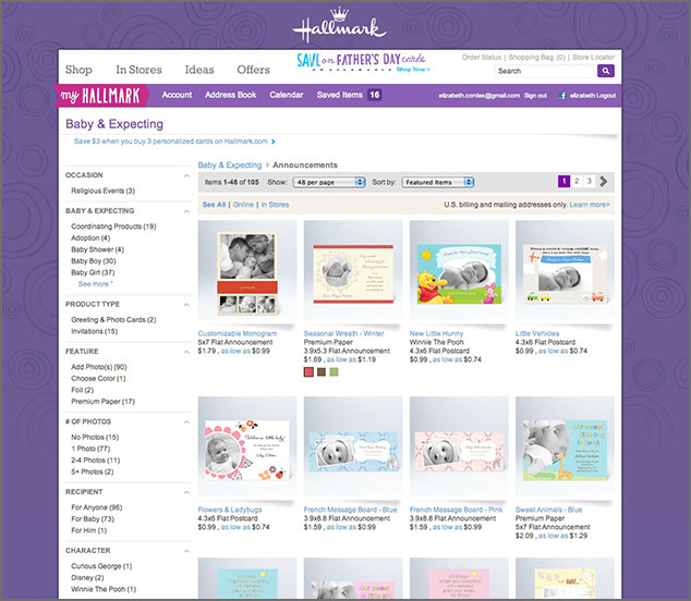
2015
Transparently, the designer in me hates this version, but the UXer in me believes in it wholeheartedly. The appearance of the filters along the left side of the screen is clunky and obtrusive to the clean, airy feel of 2014. Still, we had data showing us that users wanted the filters exposed.
Our conversations with users showed us that they struggled to understand how to use the filters in the 2014 version. Designed very mobile-first, those filters acted almost entirely the same on desktop as they did on mobile. However, users have an ingrained understanding of “filtering” on desktop, and really did miss seeing the filters on the left side, even if it was overwhelming.
The data also showed that an average shopping experience saw 2.5 interactions with the filters. We decided it no longer made sense to “hide” this functionality when users interacted with it several times per shopping session.
KEY RESULTS
Our biggest victory over the years is not really quantifiable. We managed to qualm the fears of our business leaders and our independent store owners, proving that digital will help our business, not hurt it. On a more granular level, these are the 2 biggest highlights.
93% YoY increase in online sales
We saw exponential growth each year since our initial 2011 launch. As we expanded our product offering, refined our user experience and increased our omnichannel capabilities, more and more people came to shop our website.
218% increase to Net Promotor Score
With focuses on user testing and best practices as defined by the Neilsen Norman Group and the Baymard Institute, we increased our overall NPS from 11 in 2014 to 31 in late 2016.