Digital Strategist
Partnered with a representative from the neighborhood association to set goals for the new site, and determine maintenance strategy going forward.
Development Lead
Using open source functionality from WordPress, WooCommerce and Modern Tribe, I installed and tested all applicable tools to achieve the client’s goals for ecommerce, events and recurring memberships.
Creative Director
Created a new visual direction for the online presence of the neighborhood, complete with a new logo, color palette and page layouts.
Project Manager
Created a feasible 5-phase project plan which spanned a 9-month period. Coordinated regularly with the client to keep the project on schedule and budget.

The Goal
Lafayette Square has rightfully earned a reputation of beauty among St. Louisans. Originally founded as a French village, its roots still shine through today in its gorgeous Victorian architecture.
However, their website was far from beautiful. Outdated and difficult to use, it provided little help of providing its users of local information. It also prevented people from easily purchasing tickets to the neighborhood’s biggest fundraisers, their bi-annual house tours.
The client wanted to provide a more friendly face for their neighborhood in order to attract more visitors from around the metro area. Additionally, the client wanted to enhance their online experience in order to sell more online tickets for their house tours, which would ease the logistics of an already complicated day.
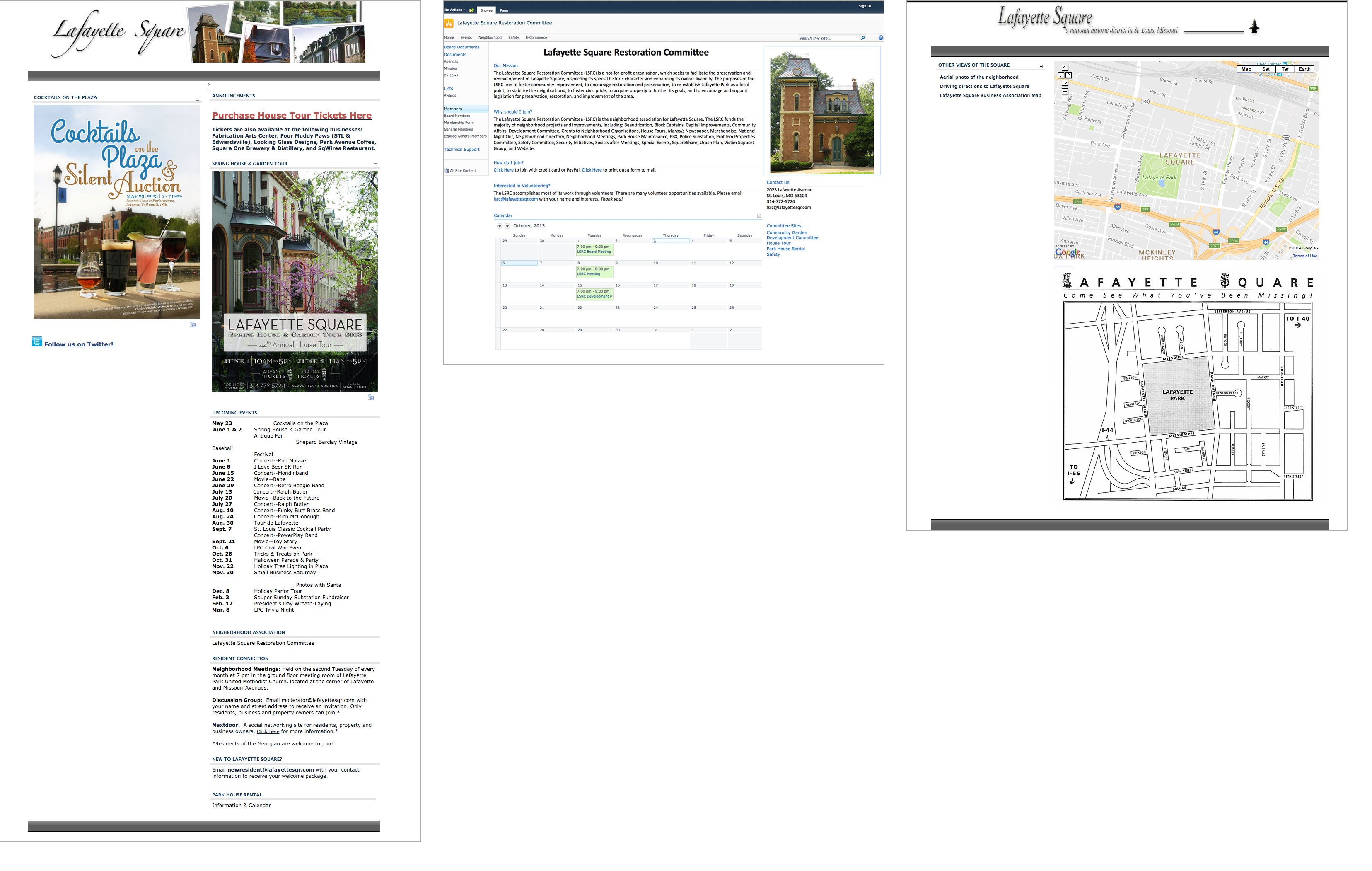
BEFORE THE REDESIGN
The site previously had a number of issues. Its biggest problem was its inconsistent navigation across sections of the site, which made it difficult to find information.

The Approach
In early 2013, the Spring house tour was fast approaching, and the client wanted to roll out their new ticket purchasing experience. With the green light from the client in April and the house tour the first weekend in June, I quickly pulled together a phased project plan, complete with cost estimates for each.
The quote I provided for them for the first phase was higher than they expected, because it included the fee for creating the proper foundation for future phases. The client pushed back, asking why they needed pay for that upfront. I responded by using the analogy of building a house.
“Let’s say you asked someone to build you a new house. But for now, you only want them to complete the master bathroom, and nothing else. You wouldn’t be surprised when they insisted they had to dig the foundation in order to complete the bathroom. This situation is similar. Although we won’t put the finishes on the rest of the website, the only real way to get this one section of the site ready is to complete another chunk of the effort now, in prep for future phases.”
They understood immediately and approved the estimate.
After launching the new ticketing experience in early May, I got to work on the remainder of the website.
DISCOVERY
In talking with the client, we determined the two main user groups—residents and non-residents. They each have unique needs, for example:
I am a resident to the neighborhood, and I…
- Am looking for information about the Community Garden
- Need to file a city service request
- Want to purchase a membership to the Lafayette Square Restoration Committee
- Want to make a donation to the neighborhood
- Want to join the Business Association
- Want to read the latest information about the neighbhorhood
- Am looking for information about volunteering in the neighborhood
I am a visitor to the neighborhood, and I…
- Want to buy house tour tickets
- Want to find information about how to spend my day in the neighborhood
- Want to make a donation to the neighborhood
- Am looking for information about having an event in Lafayette Park
- Want to find information about businesses in the area
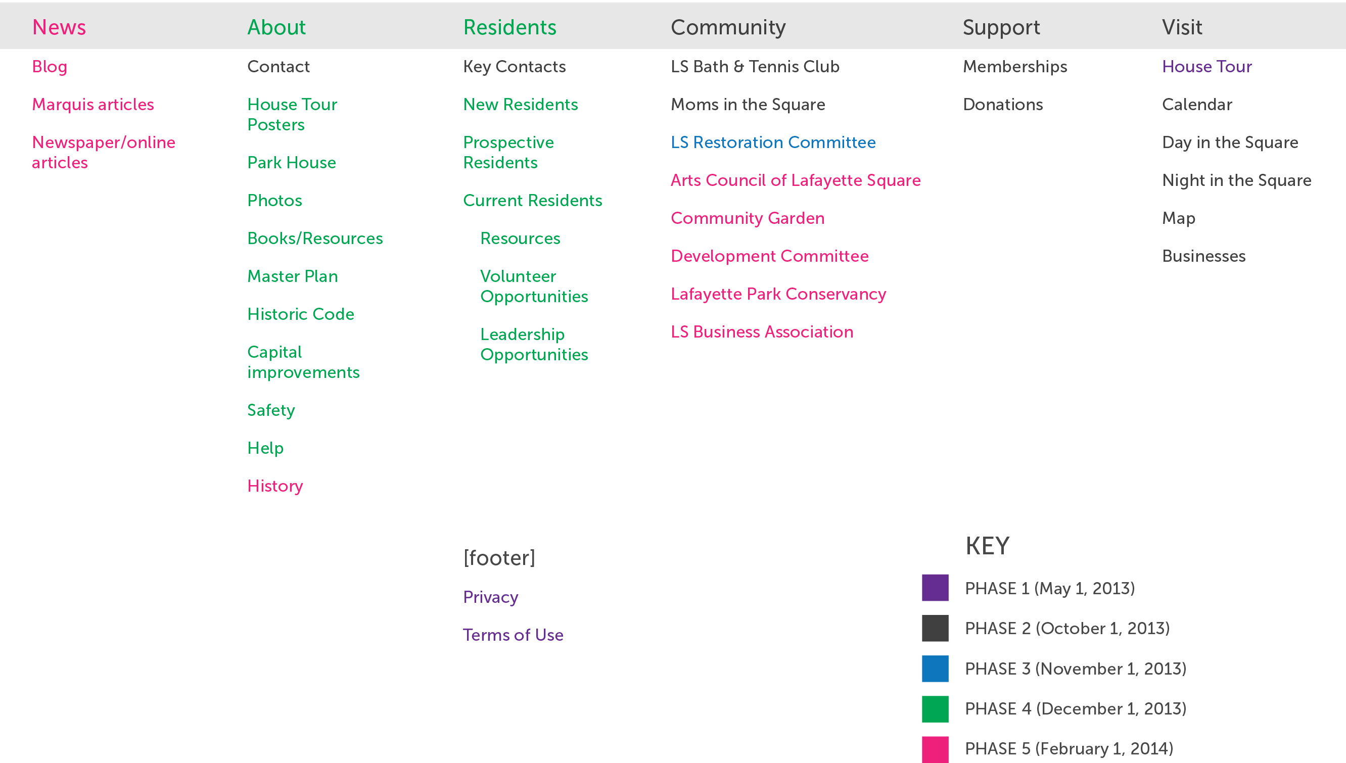
TAXONOMY
I constructed the taxonomy to be easy for all types of users to easily find the information they were looking for, no matter their context.

RESULTS
After 3 years, the website is still a success and going strong. I have been providing ongoing maintenance, advice and development support for this website since launch. The client has been really pleased with the results, especially with the extra funds they now have from the dramatic increase in house tour ticket sales. They have been using their increased revenue to make improvements to the neighborhood.
1150% increase in online revenue
The new experience has greatly increased online ticket sales. This has prevented long lines of people purchasing “day-of” tickets, therefore making the whole experience easier for both the organizers and the attendees.
700% increase in Facebook followers
I added a Facebook like button to their footer, encouraging more engagement with their social presences.
Decrease in support calls
The website provides answers to questions that previously, people would need to call a customer service number to answer. Fewer calls means that volunteers are now freed up to focus their volunteer hours elsewhere in the community.
TOOLS USED